When people think about color in branding, they usually picture bold reds, calming blues, or energetic yellows. But there’s an entire category of colors that quietly do a lot of heavy lifting, that is neutral colors like black, white, and gray.
They may not grab attention the same way bright tones do, but they play a crucial role in shaping how a brand feels, functions, and connects with its audience.
In 2025, brands are leaning more into subtlety and sophistication. That’s where neutral colors come in. They’re flexible, timeless, and when used well, they can amplify trust, clarity, and professionalism without shouting for attention.
Whether used as a main color or a supporting backdrop, black, white, and gray are anything but boring.
In this guide, we’ll explore the psychological meaning behind each neutral color and how they’re being used in modern branding to send powerful, silent messages.
Highlights for This Article
- Discover how black, white, and gray shape brand perception
- Learn the personality traits each neutral color communicates
- Get real examples of brands using neutral tones effectively
- Find out when and how to use neutrals in your own branding strategy
1. The Psychology of Black in Branding
Black is bold without saying a word. It’s a color that instantly communicates authority, elegance, and sophistication. That’s why you often see it in luxury branding, tech, fashion, and even finance.
When used right, black adds weight and seriousness to a brand’s identity, like a firm handshake or a confident look.
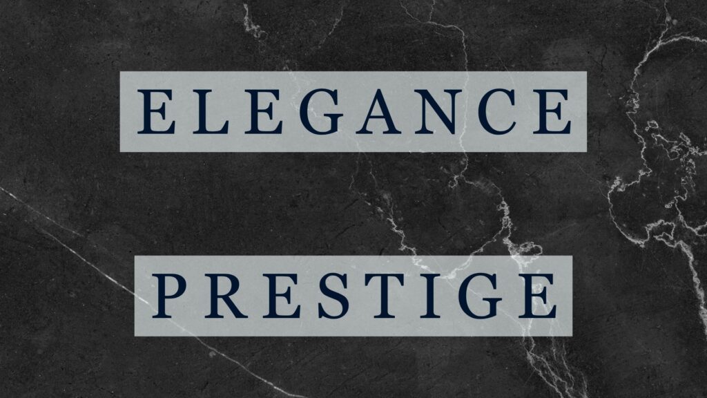
From a psychological standpoint, black is tied to power and control. It creates a sense of mystery, exclusivity, and even prestige. Many high-end brands like Chanel, Apple, or Tesla use black in their branding not because it’s flashy, but because it suggests confidence and class.
But black isn’t one-dimensional. It can also evoke feelings of secrecy or even intimidation if overused. That’s why balance matters. Pairing black with white or soft grays can help soften its intensity while keeping the strong impression intact.
On a personality level, people who resonate with black often value independence, self-control, and depth. Brands that want to align with this audience are those who prefer clarity over noise, they tend to lean on black to signal that they mean business.
Visually, black also offers excellent contrast. It can make other brand colors pop, making it a favorite choice for typography, backgrounds, and logos that need to stand out cleanly without feeling cluttered.
Whether you’re designing a luxury website or packaging for a premium product, black helps you say more by saying less. It brings instant credibility if you use it with intention.
Breakdown of Color Meaning and Usage – Black
 Positive Associations of Black:
Masculinity
Confidence
Strength
Security
Luxury
Elegance
Authority
Sophistication
Innovation
Functionality
Efficiency
Wealth
Power
Classic appeal
Prestige
Charisma
Enigma
Emotional stability
❌ Negative Associations of Black:
Death
Grief
Damage
Destruction
Darkness
Emptiness
Sadness
Loneliness
Depression
Despair
Harshness
Mystery
Intimidation
Evil
Oppression
Coldness
Separation
Effective Use of Black (Recommended For):Widely used for logos in industries like footwear, accounting, music, and film
Suitable for creating a dark, edgy, or mysterious impression (e.g., villain or monster themes)
Effective for conveying a slimming or sleek appearance in fashion
❌ When Black Is Not Recommended:
When aiming to convey purity or cleanliness
As a website background (especially with white text), which may reduce readability
🔑 Key Takeaways:
- Black conveys power, elegance, and exclusivity, ideal for luxury and premium branding.
- Psychologically, it reflects independence, confidence, and depth.
- Best used with contrast or accents to avoid looking too harsh or cold.
2. The Psychology of White in Branding
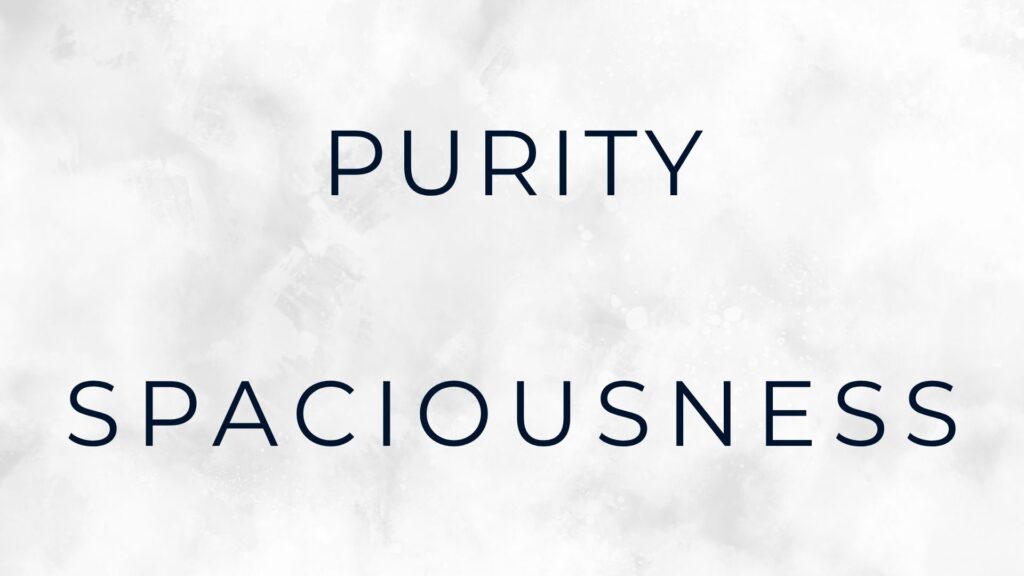
White is the color of clarity. It represents purity, simplicity, and space. In branding, white often acts like a clean slate, it gives breathing room, highlights important elements, and builds a sense of order.
Whether used as a background, primary color, or in negative space, white plays a key role in how we experience a brand visually and emotionally.
Psychologically, white symbolizes honesty, safety, and new beginnings. That’s why it’s so common in industries like healthcare, wellness, and tech sectors where trust and transparency matter.
Think of brands like Apple, which uses white to communicate minimalism and innovation, or Dove, which leans into white to promote cleanliness and softness.
From a personality standpoint, white is often linked to perfectionists, idealists, or people who value order and balance. It signals a desire for simplicity and structure. Brands that want to appear clean, fresh, or calming often turn to white to communicate exactly that.
There’s also a cultural aspect to white. In Western countries, white is tied to weddings, peace, and cleanliness. In some Eastern cultures, it’s associated with mourning or spiritual transition. So depending on your target audience, the symbolism of white may vary, but its impact remains strong.
Design-wise, white can do a lot with very little. It makes layouts feel open, makes text easier to read, and allows color accents to stand out more. It’s especially effective when combined with black or gray to create a timeless, balanced look.
In short, white may seem like “nothing,” but in branding, it does everything.
Breakdown of Color Meaning and Usage – White
✅ Positive Associations of White:
Purity
Innocence
Calmness
Holiness (sinless)
Spaciousness
Gentleness
Cleanliness
Peace
Hygiene
Honesty
Softness
Sincerity
Exotic feel
Sterility
Authenticity
Lightness
Heaven
❌ Negative Associations of White:
Coldness
Isolation
Sign of surrender
Fatigue
In some parts of Asia and the East (e.g., Vietnam), white symbolizes death
✅ Effective Use of White (Recommended For):
Websites
Presentations (PowerPoint)
Interiors where a spacious and clean impression is desired
❌ When White Is Not Recommended:
When aiming to evoke an evil or threatening impression
When trying to convey dominance or authority
🔑 Key Takeaways:
- White represents simplicity, purity, and space. Ideal for clean and modern branding.
- It appeals to audiences who value clarity, balance, and trust.
- White is versatile across cultures, but always requires thoughtful use.
3. The Psychology of Gray in Branding
Gray sits right in the middle of black and white, literally and emotionally. It’s a color that signals neutrality, balance, and composure.
In branding, gray often takes on the role of the calm, steady voice in a noisy market. It doesn’t scream for attention, but it communicates maturity, stability, and understated confidence.
Psychologically, gray is linked to logic and control. It avoids extremes and feels grounded, which makes it ideal for brands that want to be seen as dependable and serious. You’ll often see gray in industries like finance, law, or tech where trust and consistency are key.
Audi: For example, Audi frequently uses gray (particularly in its sleek, metallic vehicle finishes and minimalist advertising) to project advanced engineering, sophistication, and understated professionalism. It aligns with their “Vorsprung durch Technik” (Progress through Technology) ethos.
From a personality perspective, gray reflects a more reserved or cautious mindset. People drawn to gray tend to be practical, thoughtful, and composed.
Brands that use gray often aim to attract customers who appreciate subtlety over flashiness, and who are looking for solutions that feel safe and tested.
But gray isn’t just about being “boring.” It can also be elegant, especially when paired with metallic tones like silver or deep accent colors. It’s a great choice for backgrounds, text, or product packaging when you want other elements to stand out without losing a sense of harmony.
Too much gray, however, can feel cold or uninspiring. So it’s best used with contrast and adding a touch of blue, white, or even soft gold can bring warmth and depth to the overall look.
In the right hands, gray brings quiet confidence. It’s not a color that tries to impress, but it simply shows up and gets the job done.
Breakdown of Color Meaning and Usage – Gray
✅ Positive Associations of Gray:
Seriousness
Independence
Spaciousness
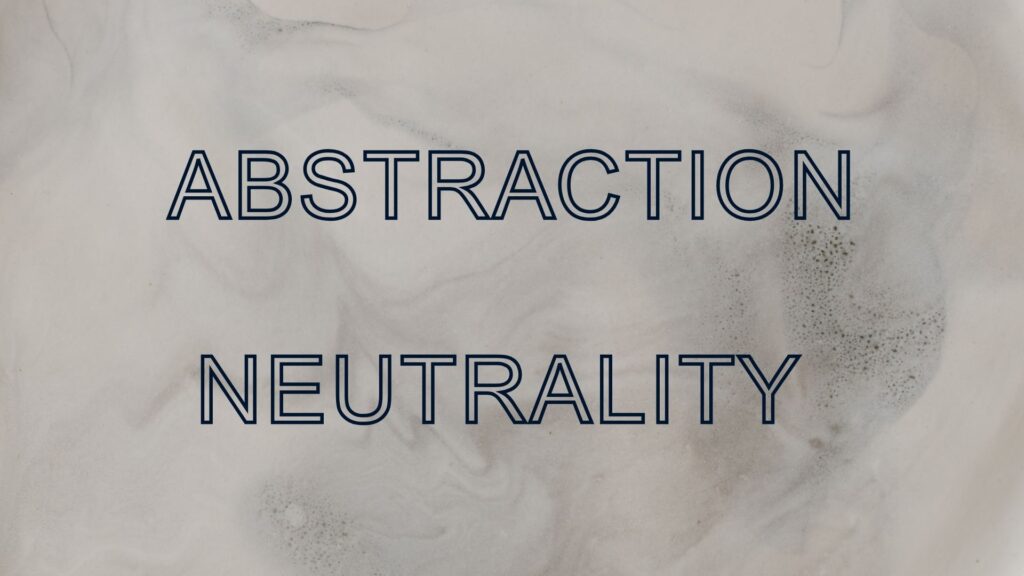
Abstraction
Stability
Neutrality (non-biased)
Responsibility
❌ Negative Associations of Gray:
Sometimes referred to as the “color of sadness”, depression, or defeat
Lack of communication
Boring or uninteresting
Lack of self-confidence
Dullness
Depression
Hibernation
Low energy
✅ Effective Use of Gray (Recommended For):
Commonly used in finance, photography, and medical industries
Useful for supplementary descriptions or secondary text
❌ When Gray Is Not Recommended:
Feminine products
Food-related products
Cheerful or playful branding
🔑 Key Takeaways:
- Gray signals balance, logic, and professionalism—ideal for serious, trusted brands.
- It appeals to practical, composed audiences who prefer subtlety.
- Works best when paired with contrast to avoid feeling dull or lifeless.
How to Use Neutral Colors Strategically in Branding
Neutral colors are more than just background players, they can shape your brand’s entire personality when used with intention. Whether you’re aiming for elegance, simplicity, or authority, the right combination of black, white, and gray can reinforce your message without overwhelming your audience.
So how do you use them effectively?
Start by deciding the role you want neutral colors to play.
If you’re building a premium or minimalist brand, black and white can serve as your core palette. Black can ground your design, while white provides space and clarity.
If you want to signal balance or seriousness, gray can be your base or a soft accent.
Neutral tones also help other colors shine. For example, a bold accent color like red or blue becomes more impactful when placed against a neutral background. That’s why many brands use white or light gray as a website base, it helps guide attention and makes interfaces easier to navigate.
You should also consider audience expectations. A healthcare brand that uses too much black might feel unapproachable, while a luxury brand that avoids black might lack edge. It’s all about context and balance.
And don’t forget consistency. If your logo uses black and gray, but your website is full of pastels, it sends mixed signals.
Neutral colors work best when they’re integrated across your branding like logo, website, packaging, and even typography.
Used strategically, neutral colors can make your brand feel confident, clear, and timeless.
🔑 Key Takeaways:
- Use neutral colors intentionally, each tone communicates something different.
- Neutrals help highlight accent colors and improve visual clarity.
- Consistency across platforms strengthens brand identity.
Closing Thoughts – The Elegance of Neutral Colors
In a world where brands fight for attention using louder colors and louder messages, sometimes the strongest move is restraint. That’s the beauty of neutral colors, they let your brand speak without shouting.
Black, white, and gray may seem simple at first glance, but they’re rich with meaning and full of strategic potential.
These colors not only use to fill space but they create space. They allow your message to breathe, your visuals to stay clean, and your audience to focus.
Whether you’re aiming for high-end luxury, trusted professionalism, or minimalist modernism, neutral tones can do the heavy lifting without stealing the spotlight.
In branding, simplicity is power. And when you choose to lead with clarity, balance, and purpose, neutral colors become more than a background—they become your brand’s foundation.