Why Do Cool Color Matter in Business and Branding? When it comes to building trust, perception matters and few things influence perception faster than color.
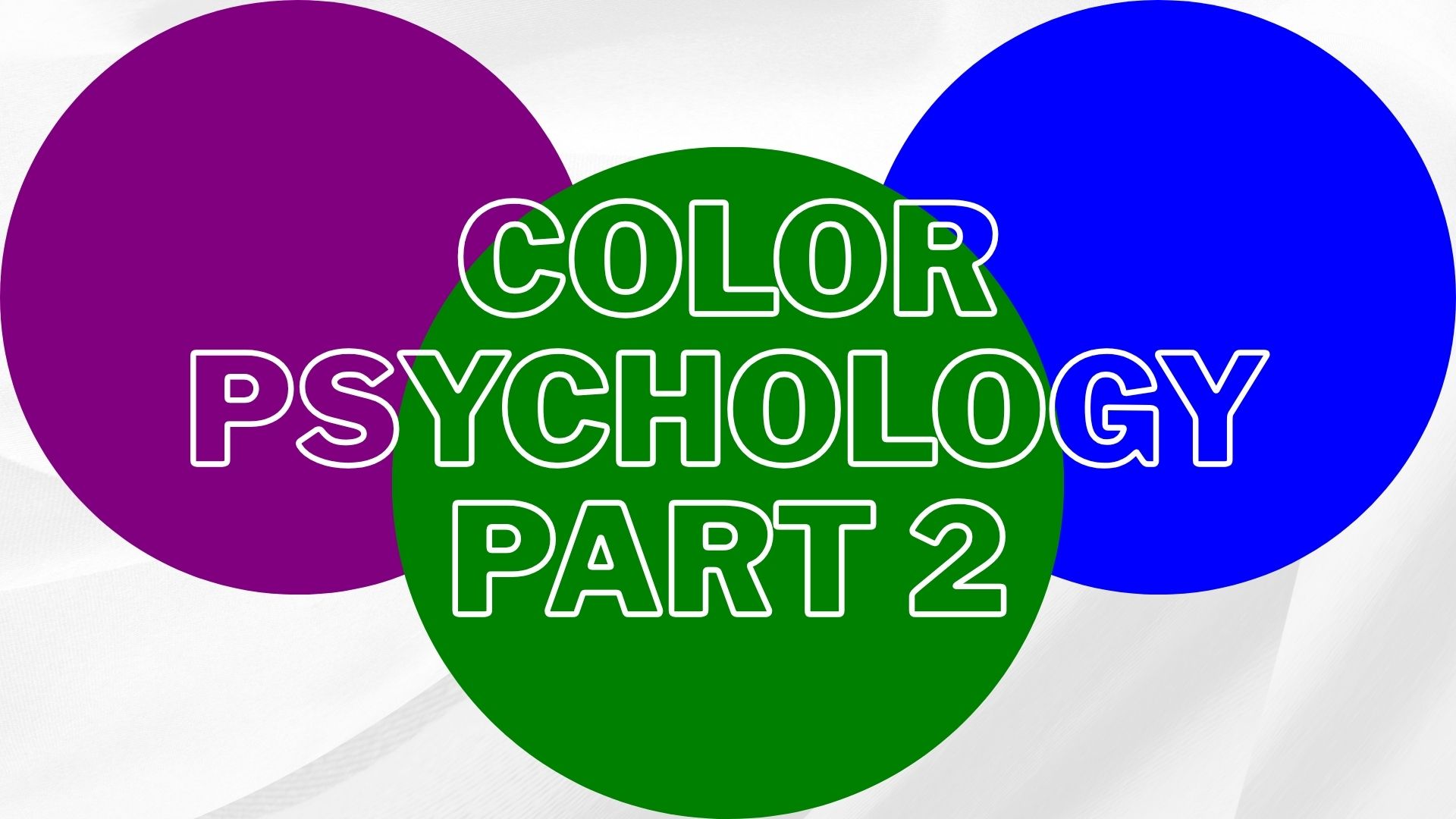
Among the wide range of hues, cool colors like blue, green, and purple stand out for their ability to calm the mind, project stability, and create emotional connections.
Unlike warm colors that energize and grab attention, cool colors are more subtle. They don’t shout, they reassure.
Think of a calm ocean, a fresh forest, or the quiet luxury of a deep purple fabric. That’s the kind of emotional space cool colors occupy. They create an atmosphere of confidence, calm, and clarity.
In branding, these colors often appear in industries where credibility and peace of mind are essential, like finance, healthcare, sustainability, and luxury. But there’s more to it than just picking a color that “looks nice.”
Each of these colors carries layers of psychological and cultural meaning. Understanding what they say about your brand without a single word is key to using them effectively.
This guide breaks down the individual meanings of blue, green, and purple in how they affect people emotionally, what they symbolize, and where they work best.
If you want your audience to feel secure, inspired, or refreshed just by looking at your brand, this is where it starts.
🔑 Key Takeaways:
- Cool colors build emotional trust and calm.
- Blue, green, and purple each create a different psychological response.
- Choosing the right cool color can shape how your brand is perceived instantly.
1. Blue: Calm, Stability, and Authority
There’s a reason why so many global brands, from banks to tech giants, lean heavily on the color blue. It’s the most universally liked color, and in color psychology, blue is often associated with calm, reliability, and professionalism.

People naturally connect blue with a sense of order, safety, and logic. It doesn’t excite or stimulate like red, it slows things down, puts people at ease, and builds trust.
From a business perspective, that’s gold. If your brand is trying to communicate credibility, expertise, and long-term commitment, blue delivers. That’s why companies like Facebook, PayPal, and Ford have used it for decades. It’s the color of “we’ve got this handled.”
Blue Color Meaning in Psychology
At its core, the blue color’s meaning revolves around mental clarity, peace, and focus. Lighter shades suggest friendliness and clarity, often used in healthcare or social platforms, while deeper blues convey authority and strength.
In professional spaces, it can help lower stress levels and improve concentration.
Psychologically, blue is also linked to introversion and introspection. It encourages internal thought and clear communication, making it ideal for brands that want to appear thoughtful and intelligent, not loud or impulsive.
Color Blue Symbolism Across Cultures
While blue tends to have positive associations globally, it’s worth noting its symbolic layers. In Western cultures, blue represents loyalty, law, and reason.
In Eastern cultures, it can symbolize long lasting or healing. Across both, blue rarely evokes danger or negativity, making it one of the safest and most strategic choices in branding.
Color blue symbolism also connects to trustworthiness and responsibility. In law enforcement, uniforms are often blue for a reason: to appear composed and controlled. In business, that same logic applies when trying to win client trust.
Blue Color Aura Meaning and Personality
If you dive into more metaphysical or emotional interpretations, the blue color aura meaning is often tied to communication, truth, and emotional depth. People with a “blue aura” are typically seen as calm, loyal, and supportive.
From a brand personality standpoint, blue signals consistency. If your brand wants to show up as the dependable one or the steady hand in a chaotic world, blue is your color.
However, there’s a risk in overusing blue: it can come off as too cold, corporate, or distant if not balanced with other tones. That’s why smart brands often combine blue with accent colors that add energy or emotion.
Where Blue Works Best
Blue is ideal for:
- Financial institutions and fintech brands
- Healthcare and wellness services
- B2B and SaaS companies
- Government or legal entities
- Corporate consultancies
Avoid using blue if you’re trying to appear bold, disruptive, or overly emotional, it’s not the color for drama or passion. But if you want clarity, calm, and trust, blue rarely disappoints.
🔑 Key Takeaways:
- Blue promotes calm, confidence, and mental focus.
- It’s ideal for brands that want to appear stable, trustworthy, and intelligent.
- Overuse can make a brand feel cold, combine wisely with warmer accents if needed.
2. Green: Balance, Growth, and Freshness
If blue builds trust through logic and calm, green builds trust through balance and connection with life. It’s the color of nature, renewal, and health.
In color psychology, green often signals peace, vitality, and stability, making it a favorite for wellness brands, eco-conscious companies, and even financial institutions.

But green isn’t just about leaves and forests. It also taps into a deep psychological need for harmony. People are drawn to green when they crave reassurance, healing, or balance. It gives off a “we care” energy without feeling forced or artificial.
Green Color Meaning in Psychology
The green color meaning is rooted in equilibrium. Sitting right in the middle of the color spectrum, green is seen as the most restful and stable hue to the human eye. It’s often used in hospitals, schools, and workplaces to reduce anxiety and create a sense of comfort.
Lighter greens suggest freshness, youth, and growth, making them great for organic products, startups, or wellness-focused businesses. Darker greens imply wealth, tradition, and security, perfect for banks or institutions that want to appear established and responsible.
Green is also known to spark creativity and compassion. Unlike red or yellow, which demand attention, green invites interaction. It doesn’t push, it welcomes.
Green Color Meaning in Personality
From a personality angle, people who resonate with green are often perceived as balanced, nurturing, and dependable. The green color meaning personality is tied to empathy, loyalty, and a strong connection to the environment and community.
In branding, this plays out through companies that want to show they’re grounded and people-focused. A green brand often signals: “We grow with you. We understand your values.”
It’s especially effective in industries like:
- Organic food and skincare
- Environmental initiatives
- Healthcare and therapy
- Education and family services
Using Green in Branding and Marketing
Visually, green works beautifully in both digital and physical environments. It blends well with natural imagery, photographs, and minimalist design. In packaging, green stands out on white or kraft paper backgrounds, making it popular in eco-friendly branding.
Green also plays well with other colors. When paired with white, it looks clean and pure. With brown, it feels earthy and rustic. With gold, it adds a sense of upscale natural luxury.
But a word of caution, too much green, especially in the wrong shade, can feel dull or even sickly. Bright neons may come off artificial, while murky greens can look outdated. Choosing the right tone is key to getting the emotional response you want.
🔑 Key Takeaways:
- Green represents balance, renewal, and emotional connection.
- It’s ideal for brands focused on health, sustainability, and personal growth.
- The right shade of green can signal anything from fresh startup energy to timeless stability.
3. Purple: Creativity, Luxury, and Wisdom
Of all the cool colors, purple is the most emotionally complex. It blends the calm of blue with the energy of red, creating a color that feels both grounded and imaginative.
In color psychology, purple is known for representing creativity, depth, and luxury. It’s a color that encourages reflection and also inspires bold ideas.
Throughout history, purple has been linked to royalty, mysticism, and wealth. It was once so rare and expensive to produce that only nobility could afford to wear it.
That legacy still carries weight today. When you see purple in branding, it often hints at something premium, thoughtful, or unique.
Purple Color Meaning and Symbolism
The purple color meaning symbolism runs deep. It’s associated with imagination, intuition, and artistic expression, but also with dignity and wisdom. In modern branding, purple can feel both futuristic and refined depending on how it’s used.
Lighter purples like lavender suggest calm and delicacy, often used in wellness or skincare. Darker purples convey power, mystery, or luxury, they are perfect for products or services that want to feel elite or rare.
Purple also creates a sense of emotional richness. Unlike blue or green, which tend to soothe or ground, purple stirs deeper thought. It’s not a passive color, it asks to be noticed, but in a thoughtful, sophisticated way.
Purple Meaning in Personality
The purple meaning in personality often aligns with traits like intuition, imagination, and sensitivity. People drawn to purple are typically independent thinkers, those who prefer meaning over trends, depth over surface.
In a branding context, purple works best when your audience values creativity, elegance, or personal growth. It’s effective for:
- Creative agencies
- Luxury products or experiences
- Mindfulness or meditation services
- Educational brands that focus on deep thinking or innovation
However, purple isn’t a “safe” color like blue or green. Used poorly, it can feel too eccentric or overly serious. But used with intention, it builds intrigue and emotional resonance.
Brands who use Purple: Cadbury, Fedex, and Yahoo!
🔑 Key Takeaways:
- Purple blends calmness with energy, symbolizing creativity and depth.
- It’s ideal for brands aiming to feel luxurious, artistic, or introspective.
- The right purple tone can set your brand apart without shouting.
Cool Colors in Practice – How to Use Them in Business & Design
Knowing the psychology behind cool color is one thing, using them effectively in real-world branding is another. While blue, green, and purple each have distinct meanings, how you apply them depends on your message, audience, and visual identity.
Choosing the Right Cool Color for Your Brand
Start with what you want your audience to feel.
- If you’re aiming for trust and reliability, blue is a safe choice.
- If your brand is health-related or focused on environmental values, green might communicate your mission better.
- Want to convey creativity or offer a premium product? Purple adds just the right touch of elegance.
But context matters. The same shade of blue that feels trustworthy in a bank’s website might feel cold and impersonal in a wellness brand. The success lies in choosing the right tone, contrast, and combination.
Combining Cool Colors With Other Elements
Cool colors work best when they’re part of a thoughtful palette. Blue paired with gray looks sleek and professional. Green with white feels fresh and modern. Purple with gold or deep black can feel luxurious and dramatic.
Balance is key. Too much blue may feel corporate. Too much green can look plain. Purple, if overused, may confuse instead of inspire. The best designs use cool colors as emotional anchors, balanced by neutral or contrasting tones.
Real-World Examples
- Facebook: Blue suggests trust, connection, and calm. Perfect for a social platform.
- Tokopedia: Uses green to symbolize growth, freshness, and trust, aims to build a friendly and continuously expanding shopping ecosystem.
- Yahoo! (Web services): Uses purple to appear creative, fun, and approachable in the tech space.
The goal isn’t to pick a trendy color but to choose one that matches your brand’s emotional intent.
🔑 Key Takeaways:
- Choose a cool color based on how you want people to feel: trust, calm, freshness, or depth.
- Use complementary tones to avoid looking flat or overly serious.
- Brands like Facebook and Tokopedia show how cool colors build long-term trust and recognition.
Conclusion – Building Emotional Connection with Cool Colors
Colors don’t just decorate your brand, they define how people feel about it. And when it comes to trust, calm, and clarity, cool color are among the most powerful tools you can use.
Blue builds a sense of logic, professionalism, and stability. Green speaks to harmony, growth, and health. Purple taps into imagination, luxury, and emotional depth.
Each one carries its own emotional fingerprint and when chosen intentionally, they make your brand not just look good, but feel right.
Whether you’re designing a website, packaging a product, or creating a logo, your use of cool colors should be more than aesthetic, it should be strategic.
Ask yourself: What do I want people to feel in the first 3 seconds of seeing my brand? If the answer includes trust, calm, inspiration, or care, you’re in the right color family.
Great brands don’t use color randomly, they use it to build emotional clarity and lasting impressions. Start with that in mind, and you’ll already be one step ahead.
Curious how colors like pink, teal, black, or even gold shape modern branding? Stay tuned for Part 3, where we dive into feminine and creative colors, followed by deep explorations into neutral tones and timeless luxury palettes.
