Why Do Warm Colors Matter in Business?
When it comes to visual communication, few things are as instantly impactful as color. And among all types, warm colors like red, yellow, and orange, tend to stand out the most. They’re bold, energetic, and emotionally charged, which makes them a popular choice in marketing, branding, and product design.
But there’s more to it than just catching the eye. Warm colors can shape how people feel about your brand, influence decision-making, and even drive action.
In a world where milliseconds count, understanding how these colors affect perception is not only helpful but it’s also essential, especially in business.
In this guide, we’ll break down how warm colors work psychologically and how smart businesses use them to get ahead.
Whether you’re building a landing page, designing packaging, or choosing your brand’s color palette, knowing when (and how) to use red, yellow, or orange could give you an edge.
Looking to create stronger emotional connections with your audience? It starts with understanding the language of warm colors.
🔑 Key Takeaways:
- Warm colors are powerful tools for capturing attention and influencing behavior.
- Understanding warm color psychology helps businesses connect more effectively with their audience.
What Are Warm Colors?
Warm colors are shades that naturally remind us of heat, sunlight, and fire. Think red, yellow, and orange.
These colors often create feelings of excitement, positivity, and urgency. That’s why they’re commonly used in sales promotions, food branding, and calls to action. They grab attention and stir our emotions.
In business and design, warm colors are often used to influence mood and behavior.
Red can spark a sense of urgency, yellow creates a feeling of optimism, and orange encourages enthusiasm or spontaneity. Together, these colors form the foundation of many successful brand identities and marketing strategies.
What makes warm colors unique is how they interact with our instincts. They tend to feel closer, more personal, and more emotionally charged than cooler tones like blue or green.
That makes them especially effective when your goal is to energize, inspire, or trigger quick decisions.
Before we dive deeper into each color, let’s get clear on one thing: Think warm colors are all about being flashy? Wrong, they’re about being intentional.
🔑 Key Takeaways:
- Warm colors include red, yellow, and orange colors are linked to energy, heat, and positivity.
- These colors are often used to spark emotion, draw attention, and drive action.
- In business, they’re powerful tools when used with purpose and balance.
1. Red – The Color of Passion and Power
There’s no ignoring red. It’s the color of fire, blood, danger, and desire, that’s exactly why it’s so powerful in branding and marketing. When used right, red triggers a sense of urgency, boosts heart rates, and grabs attention faster than any other color.
The Psychological Meaning of Red
Red is emotionally intense. Psychologically, it’s linked to feelings of passion, excitement, and energy. That’s why you’ll often see red used in industries where quick decisions matter like fast food, retail, entertainment, and sports.
Think of brands like Uniqlo, YouTube, or Target. They don’t just use red for aesthetics; they use it to create instant emotional connections.
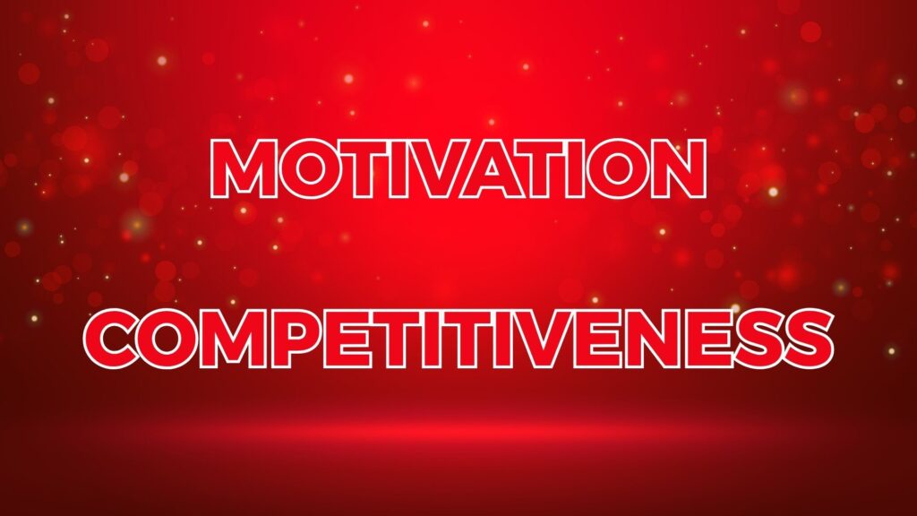
From a personality perspective, people who resonate with red are often seen as bold, assertive, and action-oriented. The color suggests dominance and confidence, traits many businesses want to project.
In color psychology, red is also associated with motivation and even competitiveness.
Red in Business and Branding
In marketing, red is commonly used to:
- Highlight sales or limited-time offers
- Drive impulse buying
- Increase visibility in crowded layouts
- Signal urgency or importance (e.g. “Buy Now” buttons)
Retailers often use red for clearance signs, call-to-action buttons, or flash deals, because it prompts quick reactions. It’s also effective in restaurants because it can subtly increase appetite and energy, hence its popularity in fast food branding.
But red isn’t just loud. In luxury or high-end branding, deeper tones like burgundy or crimson are used to communicate strength, elegance, and prestige. So while red can feel aggressive, it can also be tailored to feel bold and sophisticated.
When to Be Careful with Red
As powerful as red is, it can easily overwhelm. Overusing red or using the wrong tone can come off as aggressive, alarming, or even stressful. It’s also culturally nuanced. In some cultures, red symbolizes luck and celebration, while in others it may be associated with warning or danger.
To use red effectively:
- Pair it with neutral tones (like white, gray, or black) to tone down its intensity
- Use it strategically for high-impact areas like buttons, headers, or key messages
- Avoid full red backgrounds, especially in professional or calming contexts
Less is more when it comes to red. A little goes a long way.
🔑 Key Takeaways:
- Red is emotionally intense and associated with passion, urgency, and action.
- In business, red is used to drive quick decisions and attract strong attention.
- It should be used intentionally to avoid overwhelming or sending the wrong signal.
2. Yellow – Optimism and Attention-Grabbing
If red is the color of urgency, yellow is the color of optimism. It’s bright, cheerful, and hard to ignore, making it one of the most attention-grabbing colors in the warm spectrum.
In business, yellow is often used to create a sense of happiness, energy, and positivity. It taps into childlike enthusiasm and a feeling of fresh starts.
The Psychological Side of Yellow
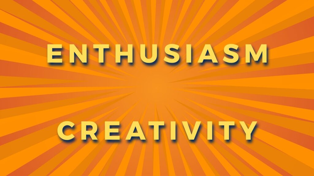
Psychologically, yellow is strongly tied to mental activity. It stimulates thinking and encourages creativity. It’s also associated with warmth, clarity, and approachability. Brands that want to come across as friendly, youthful, or energetic often turn to yellow as a key visual tool.
From a personality standpoint, yellow suggests extroversion, spontaneity, and curiosity. It appeals to those who are optimistic and open.
When you use yellow in your branding or design, you’re essentially telling people, “We’re friendly, fun, and forward-thinking.”

But there’s a twist, while yellow grabs attention, it can also become overwhelming or irritating if used too much or too harshly. That’s why using the right shade of yellow matters. Softer or muted tones feel calm and inviting, while neon or bright yellows can feel aggressive or tiring over time.
Yellow in Branding and Marketing
Yellow is widely used by brands that want to communicate approachability and energy. Some well-known examples include:
- Post-it: Employs yellow to symbolize new ideas, creativity, and the ease of jotting down and sharing information
- Snapchat: Uses a bold yellow background to stand out among social media apps.
- IKEA: Yellow gives the impression of affordability, accessibility, and a playful tone.
In business settings, yellow can:
- Highlight innovative ideas or fresh content
- Attract young or youthful audiences
- Convey friendliness and positivity in brand identity
- Make UI elements like buttons or banners stand out
Yellow works especially well in industries related to entertainment, lifestyle, kids’ products, and casual dining. It’s also useful for drawing attention to specific messages without being as forceful as red.
When to Use Yellow with Caution
Despite its cheerful vibe, yellow is also the most fatiguing color to the eye when overused. Too much brightness can create tension or even frustration, especially on screens.
In customer-facing communication, excessive yellow may reduce readability or appear less professional.
Culturally, yellow can have different meanings. In Western markets, it generally conveys warmth and positivity. In other regions, however, it might represent caution or even illness, depending on the context.
To use yellow effectively:
- Limit it to key visual areas (icons, highlights, accents)
- Pair it with dark text for strong readability
- Avoid using bright yellow on large backgrounds or body text
Used wisely, yellow brings life and personality to a brand without shouting.
🔑 Key Takeaways:
- Yellow is linked to happiness, clarity, and mental stimulation.
- It’s great for brands that want to appear friendly, youthful, or creative.
3. Orange – Energy, Confidence, and Call to Action
Orange often gets overlooked, but in reality, it combines the best traits of red and yellow. It carries the high energy of red and the optimism of yellow, resulting in a color that feels adventurous, enthusiastic, and full of momentum.
From a branding perspective, orange is flexible. It’s bold, but not aggressive. It draws attention, but doesn’t feel alarming.
That’s why it’s frequently used for calls to action buttons, sign-up prompts, and sale banners. It nudges users to act without shouting at them.
The Psychology Behind Orange
Psychologically, orange is seen as friendly, confident, and energetic. It suggests creativity, enthusiasm, and a sense of fun. People who gravitate toward orange are often extroverted, dynamic, and open to new experiences.
Unlike red, which can feel urgent or intense, orange leans more into social warmth. It encourages participation. It’s approachable without being too casual.
That’s what makes it valuable in areas like event marketing, entertainment, youth-focused branding, and even B2B products with a creative edge.
Orange is also associated with affordability. It tells customers, “We’re fun, vibrant, and worth checking out without breaking the bank.”
How Brands Use Orange
Some major brands have successfully used orange to define their identity:
- Dunkin’: Vibrant and inviting, orange embodies the brand’s friendly atmosphere and the energizing kick of its coffee and treats.
- Firefox: Dynamic and innovative, orange evokes speed and agility, perfectly capturing the browser’s quick performance and the fiery spirit of its fox logo.
- EasyJet: Bright and accessible, orange conveys a sense of affordability and cheerfulness, aligning with the airline’s no-frills, efficient travel experience.
- HubSpot: In B2B tech, orange stands out as modern, energetic, and less formal than competitors.
In UI/UX, orange is ideal for encouraging clicks. It’s commonly used for CTA buttons like “Start Free Trial” or “Get Started,” because it motivates action without being as demanding as red. It’s persuasive, not pushy.
Orange is also a go-to color for seasonal promotions like Autumn Sales, as it feels timely and vibrant.
When to Be Mindful with Orange
Like other warm colors, orange can lose its power if overused. Too much orange may come off as immature or overly casual, especially in professional or luxury settings. It also requires careful pairing with other colors, when matched with certain tones, it can feel outdated or overly bright.
To use orange effectively:
- Apply it to conversion-focused areas (buttons, badges, alerts)
- Combine with navy, charcoal, or white for balance
- Avoid oversaturation, too much orange can feel unstructured or cheap
With the right design choices, orange can become one of your most effective business tools.
🔑 Key Takeaways:
- Orange combines the energy of red with the optimism of yellow.
- It’s ideal for CTAs, promotions, and brands that want to appear bold and creative.
- Orange should be used in moderation to avoid looking unprofessional or childish.
Warm Colors in Practice: Business, Branding & Design Tips
Now that we’ve broken down red, yellow, and orange individually, let’s talk strategy. Knowing what warm colors represent is one thing, using them effectively in real-world design is another.
Where Warm Colors Work Best
Warm colors shine when used with purpose. They’re excellent for:
- Call-to-action (CTA) buttons: Orange and red tend to convert well because they’re naturally attention-grabbing.
- Promotional banners: Flash sales, limited-time offers, or big announcements benefit from the urgency that warm colors create.
- Packaging and product design: Bright colors like red or yellow can make products pop off the shelf, especially in crowded spaces.
- Brand identity: Brands wanting to appear bold, fun, energetic, or youthful often use warm tones in their logos and visual assets.
If your goal is to make people feel something quickly such as excitement, hunger, or confidence, then warm colors are your ally. But remember, it’s not just about splashing red or orange everywhere. Balance is everything.
Smart Color Combinations
Warm colors work well when paired with:
- Neutrals like white, gray, or black for a modern and grounded look
- Cool tones (blue or teal) for contrast and visual hierarchy
- Muted backgrounds that let the warm elements pop
Avoid pairing multiple bright warm colors side by side unless you’re going for a loud or playful tone like in kids’ products or entertainment brands.
Also, remember that accessibility matters. Make sure warm-colored text or buttons have enough contrast to be readable, especially for users with visual impairments.
Less Is More
Warm colors are high-impact, but using them everywhere weakens that impact. Use them to draw attention, not dominate the entire visual experience.
Conclusion – Choosing Warm Colors Strategically
Red, yellow, and orange each carry emotional weight, and when used with intention, they can influence how customers feel, react, and remember your brand.
Red creates urgency and confidence. Yellow radiates positivity and clarity. Orange brings energy and action without being too aggressive. Each one serves a unique purpose, and none of them should be used randomly.
In business, color choices shape the first impression. So instead of just choosing your favorite shade, ask: What do I want people to feel? What action do I want them to take? That’s where warm colors can help bridge the gap between design and decision-making.
Whether you’re launching a product, designing a homepage, or refreshing your logo, warm colors can be a powerful tool as long as they’re used with care and context.
Are warm colors just about style? No. They’re also about strategy.
This is just the first part of the journey. In Part 2, we’ll explore cool colors like blue, green, and purple—and how they can balance out or complement everything we’ve covered here.