Highlights
- Understand how natural and luxurious colors influence customer perception.
- Learn how brown, gold, and silver speak to different values in branding.
- Discover personality traits linked to each color and how they connect with audiences.
Natural and Luxurious Colors: What They Say About Your Brand?
In branding and design, color is more than decoration, it’s vital communication. Every shade carries its own psychological weight, influencing how people feel about a product, a service, or even a company at first glance.
In this part of the color psychology series, we’re diving into three powerful shades: brown, gold, and silver. These aren’t just pretty colors.
Brown speaks of earthiness and dependability, gold screams wealth and prestige, while silver hints at elegance with a modern twist.
These three sit in two distinct camps, natural colors and luxurious colors, and they’re often used to trigger trust, sophistication, or exclusivity.
Brown is grounded and honest. Gold is bold and rich. Silver? It’s sleek and calm. And when used right, they can elevate your brand identity in ways you might not expect.
Whether you’re creating a premium product line, building a sustainable brand, or simply want your logo to spark a specific feeling, understanding what these colors represent is essential.
1. Brown – The Color of Stability and Earthiness
Brown might not be the flashiest color out there, but it has something a lot of brands want, that’s trust.
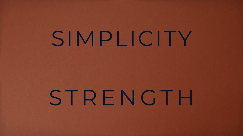
It’s a grounded, no-nonsense shade that immediately brings up ideas of nature, wood, leather, soil, and warmth. It feels real, dependable, and safe. That’s why brown is considered a natural color in the world of design. It’s deeply rooted in the physical world, which makes it feel authentic and approachable.
In color psychology, brown often symbolizes stability, reliability, and comfort. It’s the color of tradition and routine, two things that feel solid and trustworthy.
When people see brown in a brand, they tend to associate it with honesty, craftsmanship, and a grounded personality. That’s why it’s a favorite for products that want to emphasize heritage, organic origins, or artisanal quality.
1.1 Symbolism and Emotional Impact
Brown works especially well for brands related to food, agriculture, sustainability, or anything hand-made. It communicates earthiness, simplicity, and sometimes even nostalgia.
Think of brands like UPS (reliable logistics), Hershey’s (classic chocolate), or Aesop (earthy, minimalist skincare). These companies use brown to signal tradition, trust, and down-to-earth values.
But brown isn’t always soft. In some cases, it can feel heavy or overly conservative if not balanced with lighter tones.
That’s why many modern designers pair it with cream, white, or even gold accents to give it more energy and sophistication.
1.2 Personality Traits of Brown Lovers
People who love brown tend to be seen as practical, dependable, and modest. They’re often the calm presence in the room, they give a feel such as steady, serious, and comfortable in routines. They value simplicity and substance over flashiness, and prefer quality over trends. In branding, this translates to a tone that says, “We’re here to last.”
This personality connection makes brown a great fit for brands that want to feel genuine, timeless, and low-key confident.
1.3 How Brands Use Brown Effectively
Brown isn’t trying to be trendy. It’s there to create a feeling of calm, safety, and heritage. You’ll see it in:
- Coffee brands (brown = warmth, aroma, comfort)
- Organic or eco-friendly packaging
- Luxury handmade goods, where the material speaks louder than the label
If you want your product to come across as natural, grounded, and honest, brown is a strong choice, especially in industries like skincare, furniture, and craft foods.
Breakdown of Color Meaning and Usage – Brown
✅ Positive Associations of Brown:
- Simplicity
- Seriousness
- Warmth
- Reliability
- Support
- Comfort and safety
- Maturity
- Dependability
- Elegance
- Friendliness
- Nature / Natural
- Security
- Strength
❌ Negative Associations of Brown:
- Heaviness
- Bulkiness
- Stiffness
- Old-fashioned
- Harshness
- Coarseness
- Intolerance
- Overbearing
- Pessimism
✅ Effective Use of Brown (Recommended For):
- Often linked to organic, earthy, or natural products
- Common in industries related to agriculture, farming, or plantations (e.g., coffee, wood, furniture)
- Suitable for themes of honesty, humility, and grounded values
❌ When Brown Is Not Recommended:
- When representing fresh food
- When conveying a modern, visionary, or innovative tone
- When avoiding an aged or outdated impression (e.g., avoid brown shirts in presentations if wanting to look youthful or dynamic)
🔑 Key Takeaways:
- Brown is a natural color that signals reliability, earthiness, and authenticity.
- It’s linked to personality traits like practicality, modesty, and emotional stability.
- Brown works best in industries that value tradition, simplicity, and trust.
2. Gold – The Symbol of Wealth and Prestige
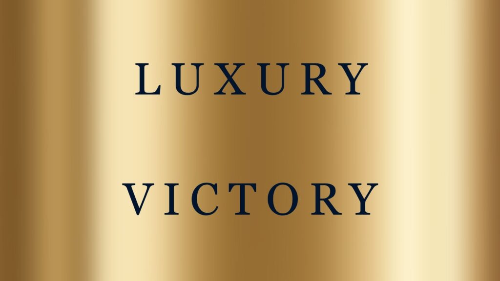
If there’s one color that immediately communicates luxury, gold takes the crown. It’s bold, eye-catching, and loaded with centuries of meaning, from royal empires to championship medals.
In branding, gold isn’t just a color; it’s a statement. It says, “This is valuable. This is elite.”
Gold stands firmly in the category of luxurious color, often used to elevate a brand’s perceived worth. It’s not subtle, and it’s not supposed to be.
When you add gold to your visual identity, you’re suggesting prestige, power, celebration, or legacy.
But using gold well requires balance. It can elevate your brand or overwhelm it, depending on how you apply it.
2.1 The Deeper Symbolism Behind Gold
Across cultures and eras, gold has consistently been tied to wealth, success, royalty, and power.
In ancient civilizations, it was reserved for gods and kings. In modern times, it still holds symbolic value: gold medals, golden tickets, golden years. It all points to something rare, desirable, and superior.
Gold also has emotional associations like confidence, energy, ambition, and sometimes a touch of extravagance. It’s often linked to optimism too, like the glow of sunrise or candlelight.
In branding, this symbolism translates into a visual shortcut for:
- Premium pricing
- Limited-edition or exclusive offers
- Products with heritage or craftsmanship
2.2 Personality Traits of Gold-Loving Audiences
People who gravitate toward gold are often seen as ambitious, confident, and achievement-oriented. They value success, but not only the outcome, also the process of getting there.
Gold lovers often enjoy recognition, high standards, and surrounding themselves with things that reflect their status or aspirations.
Psychologically, gold can also suggest:
- Refined taste
- Optimism and warmth
- High expectations
For brands, using gold taps into that mindset. You’re speaking directly to customers who value excellence, prestige, and exclusivity.
That’s why gold is common in high-end cosmetics, luxury fashion, and even premium beverages.
2.3 How Brands Use Gold to Signal Premium Value
Using gold in design is about context. Gold foil on packaging, gold typography on a black background, or even a gold logo detail can instantly create the perception of high value. But go overboard, and it starts to feel cheap or pretentious.
Here’s where gold shines in branding:
- Luxury goods: High-end watches, perfumes, fashion labels
- Celebratory campaigns: Limited-time offers, milestones, awards
- Financial services: To imply wealth, growth, and long-term success
- Spiritual or cultural brands: Gold can also symbolize enlightenment or sacred energy in certain contexts
It’s important to remember: real luxury isn’t loud, it’s deliberate. Gold works best when it’s used with restraint. Pairing it with neutral backgrounds like white, black, or navy helps the gold pop without screaming.
Even digital brands have started using “digital gold” tones—modern, muted metallic shades that feel premium without being too flashy.
Breakdown of Color Meaning and Usage – Gold
✅ Positive Associations of Gold:
- Luxury
- Achievement
- Prosperity
- Success
- Victory
- Elegance
- Activeness & Dynamism
❌ Negative Associations of Gold:
- Arrogance
- Pride
✅ Effective Use of Gold (Recommended For):
- Creating an elegant or sophisticated impression
- Suggesting a premium or high-value product/service
- Conveying exclusivity
❌ When Gold Is Not Recommended:
- When aiming to convey a simple or affordable image
🔑 Key Takeaways:
- Gold is a luxurious color that communicates wealth, power, and exclusivity.
- It appeals to personalities that value achievement, recognition, and high standards.
- In branding, gold is most effective when used strategically and with contrast, not saturation.
3. Silver – The Futuristic and Elegant Hue
If gold is bold and commanding, silver is its quieter, more refined sibling. It’s sleek, cool, and carries a sense of modern sophistication.
In the world of branding, silver often plays a balancing act, it suggests quality and prestige without being loud or flashy. That’s what makes it a go-to luxurious color for brands that want to feel premium but not ostentatious.
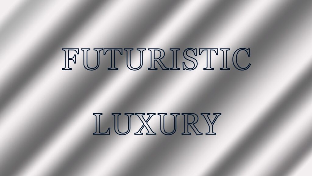
Silver is also deeply tied to technology, innovation, and progress. It’s the color of metal, of machinery, of futuristic design.
So whether you’re creating a minimalist tech brand, a luxury skincare line, or a high-performance product, silver has the flexibility to communicate both class and cutting-edge thinking.
3.1 Symbolism and Psychological Impact of Silver
Silver has long been a symbol of elegance, grace, and logic. In psychology, it’s often associated with clarity, reflection, and emotional neutrality. Unlike gold, which carries a lot of warmth and emotion, silver feels cooler, more analytical.
Silver also symbolizes:
- Precision and clarity (think surgical instruments or high-end watches)
- Mystery and moonlight, in contrast to gold’s sunlight
- Balance, especially when used as a bridge between black and white in a color palette
Its reflective quality gives it a sense of movement and fluidity, making it ideal for brands that want to appear agile, polished, and intelligent.
3.2 Personality Traits of Silver Enthusiasts
People who prefer silver are often seen as intellectual, composed, and quietly confident. They might not seek the spotlight, but they’re often detail-oriented, thoughtful, and highly self-aware.
These individuals appreciate quality, precision, and emotional balance.
Brands that use silver tend to appeal to customers who:
- Value modern elegance over flashy trends
- Are drawn to high-performance products or minimalist aesthetics
- Want to be seen as forward-thinking, but with taste
In many ways, silver is the color of quiet ambition, imagine it says, “I’m serious, I’m capable, and I don’t need to prove it with noise.”
3.3 How Silver Works in Branding
Silver is incredibly versatile.
It can be techy, elegant, or even spiritual depending on how it’s applied.
Its clean, reflective nature pairs well with dark colors like charcoal, deep blue, or black to create a premium feel.
It also works beautifully in minimalistic designs where simplicity equals strength.
Here’s where silver often shows up:
- Tech and electronics: From Apple’s MacBooks to car brands like Audi or Mercedes, silver communicates precision and innovation
- Luxury and performance: Silver is often used in high-end skincare, watches, or automobiles to suggest quality engineering
- Finance and corporate identity: It signals trust, logic, and control without the emotional overtones of gold
Design-wise, silver is usually applied as:
- Metallic foil for packaging or logo accents
- Cool gray gradients or backgrounds with a hint of shine
- Digital silver tones in UI/UX design to enhance modernity
It’s especially useful in industries where customers expect a mix of aesthetic excellence and technical reliability.
Breakdown of Color Meaning and Usage – Silver
✅ Positive Associations of Silver:
- Expensive-looking
- Strong
- Millennial appeal
- Modernization
- Wealth
- Intuition
- Futuristic
- High Technology
- Precision
- Attraction
- Luxury
- Sophistication
- Industrial feel
- Sleek
❌ Negative Associations of Silver:
- Rigid
- Perceived as “cold” or “dark” (like storms, cloudy skies, etc.)
- Glamour (in a negative, excessive way)
- Pride
✅ Best Used For:
- Conveying strength or metallic feel
- Highlighting modern elegance
- Widely used in: Graphic Design, Makeup, Spa products
- Tech-forward or futuristic products such as robots, computers, laptops, etc.
❌ Avoid Using Silver For:
- Feminine products
- Soft, gentle brands
🔑 Key Takeaways:
- Silver is a luxurious color that represents modern elegance, innovation, and emotional balance.
- It attracts individuals who value precision, subtlety, and intelligence.
- Silver shines in branding for technology, luxury goods, and minimalist design when paired with contrast and clean layouts.
Final Thought: Finding the Sweet Spot Between Nature and Prestige
Is choosing your brand’s color about what looks good?
Yes. But it’s also about what feels right for your message, your audience, and your identity.
Brown, gold, and silver may live in very different emotional spaces, but they each serve a unique purpose in how a brand is perceived.
Brown grounds your brand in honesty, simplicity, and tradition. It tells people you’re real, dependable, and connected to the earth. It’s perfect for natural products, artisanal goods, or anything that wants to feel human and rooted.
Gold elevates your image. It says you’re worth more, and you’re not afraid to show it. It works when your brand is built around luxury, achievement, legacy, and when your audience wants something exclusive.
Silver gives you a cool edge. It’s refined and forward-thinking without being loud. For brands that live in the world of innovation, design, and performance, silver helps you stand out without shouting.
The trick isn’t to pick the fanciest or trendiest color but to choose the one that aligns with your brand values and customer mindset. Sometimes, that means mixing these tones for contrast: brown and gold for heritage luxury, silver and white for modern elegance, or even brown with silver to balance earth and intellect.
Whichever direction you go, these colors are powerful tools. Use them intentionally, and they’ll speak volumes—before you even say a word.