Color is more than just visual decoration, it’s a subtle form of communication. The colors we use in branding, design, and even our everyday lives can shape how people feel, think, and respond.
In this part of our Color Psychology Guide, we’re diving into two unique hues that are often associated with emotion and imagination: pink and turquoise.
These are what many refer to as feminine colors, but they also represent balance, creativity, and emotional depth when used well.
Whether you’re building a brand, decorating a space, or just curious about how colors affect perception, understanding creative colors like these can help you connect more deeply with your audience.
Each color carries subtle psychological signals, for example pink and turquoise send messages of warmth, empathy, freshness, and clarity.
In the following sections, we’ll explore the deeper meaning behind these two colors, how they relate to personality, and why they remain favorites in design and branding.
🔑 Key Takeaways:
- Pink and turquoise are both considered creative and feminine colors, but with very different emotional effects.
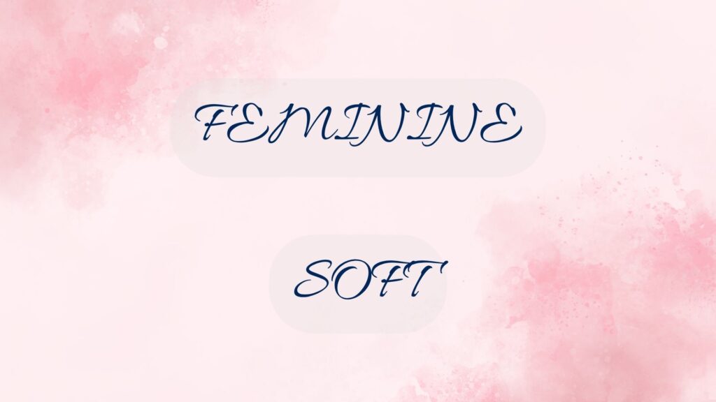
1. Pink in Psychology – Softness, Love & Emotional Impact
Pink has long been associated with emotion. Among all the colors in the spectrum, few stir feelings as gently and as powerfully as pink. In the world of color psychology, pink is a symbol of affection, warmth, and emotional softness. It’s the color of nurturing energy, often used to create a sense of safety, tenderness, and kindness.
The meaning of pink is rooted in its position as a lighter shade of red. While red speaks of passion and urgency, pink softens that energy into something more compassionate and gentle.
It’s often used in environments that aim to calm or comfort, such as health clinics, skincare products, and wellness branding.
Symbolism and Emotional Associations
The symbolism of pink has evolved over time. Traditionally tied to femininity, romance, and innocence, today pink is also seen as a color of emotional intelligence and care. It signals understanding, approachability, and empathy.
In modern marketing, pink isn’t just about appealing to women, it’s about evoking a human, emotional connection with audiences.
In visual branding, soft pinks are commonly used to make an interface or product feel soothing and trustworthy. You’ll find this shade in baby products, organic skincare, or mental health apps. These brands rely on pink’s ability to gently communicate warmth and care.
Brighter pinks, like hot pink or fuchsia, tell a different story. They’re bold, expressive, and full of energy. While soft pink whispers, hot pink shouts. These shades are popular with modern, youthful, or rebellious brands that want to stand out and challenge expectations.
Think of cosmetics, pop culture, or indie fashion—places where pink gets to be both playful and powerful.
Cultural Contexts of Pink
In Western cultures, pink often symbolizes love, sweetness, and girlhood. But context matters. In Japan, pink is linked to cherry blossoms and the transient nature of life, a more reflective, poetic symbolism.
In Korea, it’s associated with trust. In Latin America, bright pinks are widely used in festivals and folk art, representing joy and vibrance.
This cultural flexibility makes pink especially versatile. Its meaning adapts based on tone, placement, and purpose, offering a wide emotional palette for brands, designers, and communicators.
Pink Color Meaning in Personality
If someone gravitates toward pink, they’re usually seen as gentle, approachable, and emotionally open. These individuals often seek peace and harmony, preferring kindness over confrontation.
They tend to be compassionate listeners, thoughtful friends, and emotionally intuitive communicators. While this can sometimes be misinterpreted as weakness or passivity, it actually reflects a deep form of emotional intelligence.
More vibrant or hot pink personalities, however, add a layer of boldness. These are expressive, energetic, and creative individuals, often the ones who bring color (literally and figuratively) into a room.
They’re still empathetic, but they’re also unafraid to stand out or challenge norms. The emotional softness is still there, just paired with confidence and flair.
Some people adopt pink later in life as a way of reconnecting with their emotional side. It can represent a shift from aggression to calm, from ego to empathy. It’s more than just age or gender, it’s about the values someone wants to project.
When Pink Works for Branding
Brands that want to show emotional care, human warmth, or social responsibility often choose pink for a reason. In industries like wellness, beauty, early education, and nonprofit work, pink helps signal safety, emotional trust, and care. It’s also commonly used by companies that want to appear friendly, youthful, or socially progressive.
But pink doesn’t always mean “soft.” Brands like Cosmopolitan, or Glossier use bright pink to show confidence and cultural relevance. These companies combine emotional appeal with strong identity, especially for younger audiences who don’t see femininity as a limitation but a source of power.
For startups or small businesses, pink can differentiate them from colder or more corporate-feeling competitors. In a sea of black, gray, or blue logos, a splash of pink sends a strong message: “We’re not afraid to be human.”
Examples of Brands That Use Pink Effectively
- Glossier: Uses soft pink to communicate simplicity, modern beauty, and emotional intimacy.
- Breast Cancer Awareness Ribbon: A universally recognized pink ribbon symbolizing hope, support, and the fight against breast cancer, raising awareness and promoting early detection.
- T-Mobile: Magenta tone to stand out in the tech space and appear vibrant, bold, and customer-first.
- Dunkin’: A prominent pink (alongside orange) embodies the brand’s friendly, energetic atmosphere, and the delightful sweetness of its treats and coffee.
These brands don’t use pink by accident. They understand the emotional personality pink represents and they lean into it.
Breakdown of Color Meaning and Usage – Pink
✅ Positive Associations of Pink:
- Love
- Affection
- Romance
- Sincerity
- Cheerfulness
- Softness
- Physical calmness
- Nurturing
- Feminism
- Femininity
- Caregiving
- Warmth (associated with affection)
❌ Negative Associations of Pink:
- Lack of enthusiasm
- Reduced energy
- Innocence or naivety (too pure, childlike)
✅ Effective Use of Pink (Recommended For):
- General women’s products
- Girls’ toys
- Girls’ playroom decoration
- Cosmetics
- Advertising background targeting female audiences
❌ When Pink Is Not Recommended:
- Products for men or masculine branding
- Products meant to convey strength, solidity, or heaviness
🔑 Key Takeaways:
- Pink represents softness, nurturing, and emotional safety, but it can also be bold and expressive.
- Different shades of pink send different signals—from calm and gentle to loud and confident.
- Cultural context matters: pink can mean love, life, joy, or elegance depending on where and how it’s used.
- People drawn to pink tend to be empathetic, warm, and emotionally aware—traits that translate well into brand identity.
- Pink branding signals friendliness, trust, and care—especially effective for wellness, beauty, and lifestyle brands.
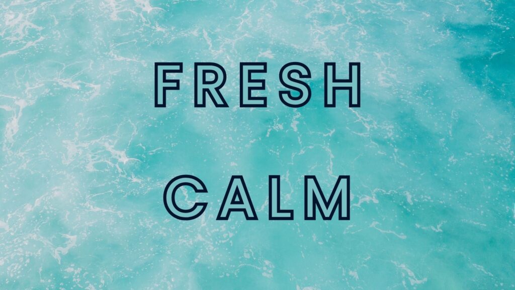
2. Turquoise in Psychology – Balance, Freshness & Creative Thinking
If you could blend the calm of blue with the growth and energy of green, you’d get turquoise. This unique hue is often described as refreshing, light, and emotionally balanced.
In color psychology, the turquoise color meaning revolves around clarity, healing, and open communication. It carries the mental calmness of blue while adding a touch of vitality and renewal from green, resulting in a color that feels both serene and stimulating.
Turquoise is commonly associated with emotional stability, creativity, and clear thinking. It’s the color of tropical waters, open skies, and clean design, making it a visual cue for freshness and freedom.
Psychologically, turquoise is believed to calm the mind without dulling it. It invites clear expression, making it ideal for settings where communication and focus are important.
What sets turquoise apart from other calming colors is its modern, almost tech-friendly personality. It feels natural and digital at the same time, which is why you’ll often find it in user interfaces, app branding, and workspaces designed for productivity. It strikes a balance between cool professionalism and open-minded creativity.
Applying Turquoise in Digital and Lifestyle Contexts
In interior design, turquoise is used to create spaces that feel relaxed but not sleepy. It works well in home offices, creative studios, and wellness-focused environments. Its clean and light aesthetic is especially popular among younger audiences and professionals who want their surroundings to feel calm yet inspiring.
The versatility of turquoise also makes it ideal for digital branding.
Many websites and apps use light turquoise as an accent color to draw attention without overwhelming the user. It’s a subtle way to guide attention while reinforcing a brand identity that values clarity, innovation, and emotional openness.
Turquoise also carries positive associations in many cultures. In Native American traditions, it symbolizes protection and strength.
In modern Western design, it’s associated with communication and balance, making it ideal for businesses that prioritize people over profits.
Personality Traits Associated with Turquoise
People who feel a connection to turquoise often exhibit a unique mix of clarity, creativity, and calm.
In color psychology, turquoise meaning in personality reflects individuals who are emotionally balanced yet expressive. These are the types who value open communication, personal freedom, and a touch of idealism.
Turquoise personalities are often described as good listeners and thoughtful communicators. They’re not usually loud or aggressive, but they know how to express themselves clearly.
There’s also a strong creative streak that people drawn to turquoise often work in design, art, writing, or other expressive fields. Unlike fiery colors that push outward, turquoise invites people in. It suggests openness without being overly intimate.
Because turquoise balances the cool logic of blue with the emotional warmth of green, it also represents emotional intelligence with creative flow.
These personalities are introspective but not withdrawn. They tend to thrive in calm environments and bring harmony to groups or teams.
This blend of clarity and creativity is one reason why turquoise is popular among designers, therapists, educators, and artists. It feels honest, clean, and visually refreshing, qualities that resonate with professionals who aim to inspire or connect.
While pink brands focus on warmth and empathy, brands using turquoise often project a sense of modern calm and trust.
The brand who uses it is Tiffany & Co., whose signature turquoise blue conveys luxury, clarity, and timeless style. It’s bold enough to be recognized, yet soft enough to remain approachable.
Breakdown of Color Meaning and Usage – Turquoise
✅ Positive Associations of Turquoise:
- Calmness
- Patience
- Emotional balance
- Stability
- Encouragement
- Relief from loneliness
❌ Negative Associations of Turquoise:
- Cold or distant impression
- Indifference
- Emotional flatness
✅ Effective Use of Turquoise (Recommended For):
- Enhancing concentration and mental clarity
- Calming the nervous system, leading to more confidence and clear thinking
- Providing emotional support during mental fatigue, stress, or loneliness
❌ When Turquoise Is Not Recommended:
- Food-related branding or products
🔑 Key Takeaways:
- Turquoise blends the calm of blue and the renewal of green, creating a balanced and refreshing emotional tone.
- It promotes mental clarity, creativity, and emotional calm—making it perfect for digital design and workspaces.
- Brands use turquoise to suggest openness, modern thinking, and a connection to nature or wellness.
- Turquoise personalities are balanced, expressive, and emotionally intelligent.
Designing with Feeling: What Pink and Turquoise Can Teach Us
Pink (feminine color) and turquoise (creative color) may come from different parts of the color spectrum, but both carry strong emotional weight.
Through the lens of color psychology, pink speaks of empathy, softness, and emotional warmth. It invites connection, nurtures trust, and can range from gentle to bold depending on its shade.
Turquoise, on the other hand, balances clarity with creativity. It’s refreshing, calm, and expressive, they are ideal for those who want to inspire without overwhelming.

What makes these two creative and feminine colors powerful is how adaptable they are. Pink can soften a brand, signal care, or energize it with confidence. Turquoise can bring focus to a digital space or infuse a design with balance and calm.
Understanding the personality and emotional impact behind these colors helps you use them more strategically, whether you’re building a brand, designing a space, or simply choosing what colors to wear or surround yourself with.
In a world overloaded with visual noise, the right color can be your quiet advantage. Pink and turquoise, when used with purpose, don’t just decorate—they connect.