Introduction: Why Colors Matter More Than You Think
When it comes to marketing, first impressions happen in seconds, also color plays a major role in how people react. You might think logos, ads, or websites work because of catchy words or clever design, but there’s something deeper at play: color psychology.
Color is not just decoration. It’s a silent persuader.
The red “SALE” signs, the calming blue of a bank’s logo, the cheerful yellow on a fast-food menu, they’re not random choices.
Marketers and designers use colors to influence emotions, guide behavior, and build strong brand identities that stick in your mind.
In this article, we’re diving into how each color works on a psychological level and how brands use that to connect with customers.
Whether you’re designing a logo, picking packaging, or running ad campaigns, understanding color psychology can help you make smarter decisions that drive action from prospect into a customer.
This isn’t about color theory for artists, it’s about why red makes people hungry and why blue builds trust. This article will also show you which colors match certain industries and give real brand examples along the way.
By the end, you’ll see color not just as a visual choice, but a business tool that drives a big impact.
What Is Color? Understanding the Basics Before the Psychology
Before we dive into how each color influences buying behavior, it helps to understand what color really is and why our brains respond to it the way they do.
At its core, color is light. When light hits an object, some wavelengths are absorbed, and others are reflected. The ones that bounce back to our eyes determine what color we see.
A ripe tomato reflects mostly red light, while a leaf reflects green. Our eyes then send this information to the brain, which processes it in less than a second.
But color isn’t just physical, it’s also deeply perceptual. Two people may see the same red slightly differently. Cultural background, personal experiences, even lighting can change how we interpret color. That’s part of what makes it such a powerful and complex tool in marketing.
To better understand how color works in branding, we should also be familiar with three core components of color:
- Hue: the basic color family (e.g., red, blue, yellow).
- Value: how light or dark a color is.
- Chroma (or saturation): how vivid or muted the color appears.
These elements explain why a soft pastel blue feels gentle and calming, while a bold electric blue feels energetic and modern, even though both are “blue.”
Marketers and designers tweak these properties to match brand personality, trigger certain emotions, or create contrast that grabs attention.
In short: Color is both science and psychology. Once you understand how it’s perceived, you’re one step closer to using it effectively to influence behavior.
Key Takeaways:
- Color is light, what we see depends on how objects reflect certain wavelengths.
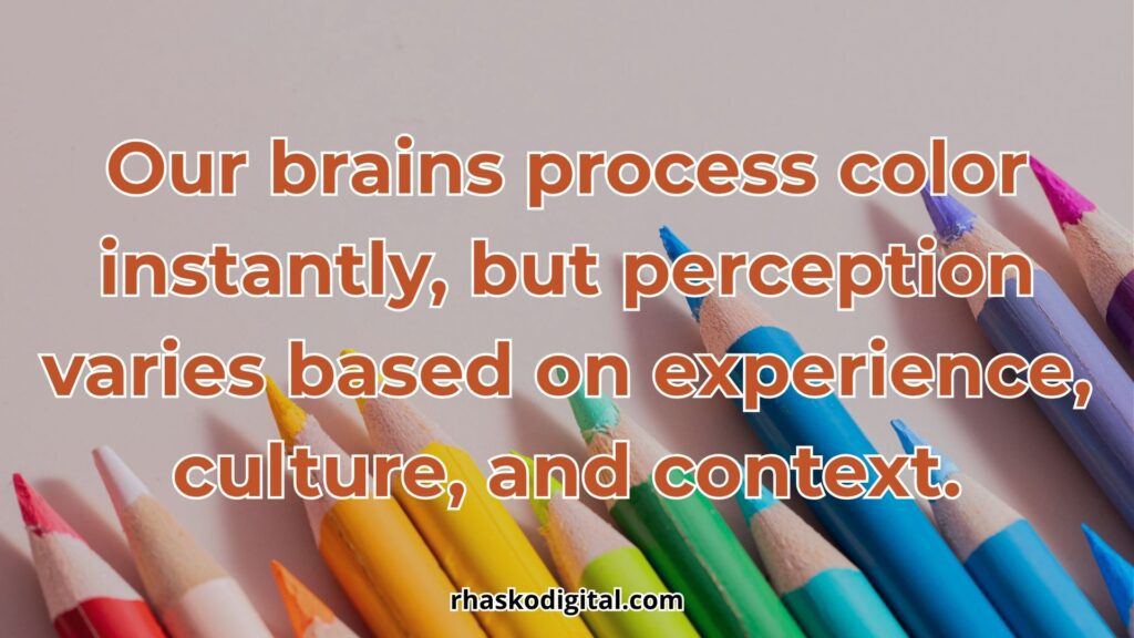
- Our brains process color instantly, but perception varies based on experience, culture, and context.
- Every color has three key elements: Hue (the color family), Value (lightness or darkness), Chroma (intensity or vividness).
- Even the same hue can trigger different emotions depending on how it’s styled.
- Understanding how color is formed and perceived lays the foundation for using it effectively in marketing and branding.
Basic Color Theory for Marketers
To use color strategically in marketing, you don’t need to be an artist or a graphic designer, even if you only have a solid grasp of basic color theory can help you make smarter decisions that influence perception and drive action.
Let’s break it down into three practical layers marketers should know:
1. Primary, Secondary, and Tertiary Colors
The color wheel is the foundation of color theory. It helps organize colors in a way that makes relationships easy to understand:
- Primary colors: Red, Blue, Yellow
These are pure colors that can’t be made by mixing other colors. They form the base for all others. - Secondary colors: Orange, Green, Purple
These come from mixing two primary colors. For example, red + yellow = orange. - Tertiary colors: Red-Orange, Yellow-Green, Blue-Purple, etc.
These are made by mixing a primary color with a neighboring secondary color.
Why does this matter in marketing? Because understanding these relationships helps in creating color combinations that are visually harmonious, emotionally coherent, and consistent with brand tone.
2. Warm Colors vs. Cool Colors
Colors are often grouped by temperature:
- Warm colors (red, orange, yellow): These evoke energy, excitement, urgency, and action. That’s why fast-food chains and clearance sales often use red or yellow.
- Cool colors (blue, green, purple): These are calming, trustworthy, and stable. These colors are ideal for finance corp, health brands, or tech companies.
Using the right temperature helps you match your brand message with the right emotional tone. For example:
- A spa brand may lean on soft blues and greens to signal peace and cleanliness.
- A fitness supplement might go with bold reds and oranges to signal power and movement.
3. Neutral Colors and Their Importance
Neutral colors such as black, white, gray, beige, brown, might not scream for attention, but they’re essential in design. They have psychological effect like:
- Balance and frame your main brand colors
- Add contrast that makes CTAs or logos pop
- Communicate minimalism, elegance, or professionalism
For example:
- Black is often used for luxury and premium brands (think Chanel or Rolex).
- White evokes simplicity and cleanliness (popular in tech and health).
- Gray is subtle and corporate, often used in B2B brands.
Neutral colors are also flexible, making them perfect backgrounds or supporting tones that let your primary colors shine.
Why This Matters for Marketers
A good understanding of color theory allows marketers to:
- Choose effective and consistent brand color palettes
- Avoid combinations that clash or confuse
- Create designs that stand out but still feel cohesive
- Understand how different color families are perceived across contexts
More importantly, these fundamentals support the deeper layer of marketing, color psychology, and the emotional meaning behind each color, which we’ll explore in the next section.
Key Takeaways:
- The color wheel helps marketers create harmonious and effective color combinations by understanding primary, secondary, and tertiary colors.
- Warm colors evoke urgency and energy, while cool colors convey trust, calm, and stability—essential for aligning with your brand’s emotional goals.
- Neutral colors like black, white, and gray play a crucial supporting role in design, helping balance visuals and highlight key brand elements.
Psychological Background of Color in Marketing
Why does red make us feel alert? Why does blue feel safe? The answers lie not just in design trends but deep within human psychology.
Color influences our thoughts, emotions, and behaviors, often without us realizing it. That’s why marketers can’t afford to treat color as a surface-level choice, it’s a psychological tool that can shape how people perceive a product, a message, or an entire brand.
1. How the Brain Responds to Color
When we see color, we’re not just seeing, but it’s an entire neurological process.
Color enters through the eyes, but the interpretation happens in the brain, specifically in the visual cortex and areas responsible for emotion and memory. This means color perception is tightly connected to how we feel and what we remember.
For example, red can trigger the amygdala, a part of the brain associated with danger and alertness. That’s why red is often used in warning signs, but marketers also use it to create urgency (e.g., limited-time offers). On the other hand, blue can reduce heart rate and promote a sense of calm, which is why it’s common in finance, healthcare, and tech.
These instinctual reactions are rooted in evolution. Bright colors often signaled ripe fruit or potential danger. Cool colors, like the shade of a calm sky or clean water, signaled safety. Our brains are still wired to respond that way.
2. Emotion, Association, and Memory
Color isn’t only about the present, it’s also about the past we carry. People link colors to memories, seasons, familiar products, and personal moments.
For instance:
- Green might remind someone of nature and freshness, even money and wealth.
- Black may feel formal and powerful to some, but cold or somber to others.
- Pink may be linked with sweetness, childhood, or femininity. Depending on context and cultural exposure.
Because of this, the same color can trigger different emotions in different people, especially across cultures and demographics. Still, there are broad psychological patterns that brands can rely on, which we’ll explore in later sections.
3. Cultural Differences in Color Meaning
One of the biggest mistakes in global marketing is assuming that colors mean the same thing everywhere. They don’t.
Let’s take white as an example:
- In Western cultures, white is often associated with purity, weddings, and simplicity.
- In some Asian cultures, white is the color of mourning and funerals.
Another example is red:
- In Western countries, red often signals passion, danger, or urgency.
- In China, red is a color of luck, prosperity, and celebration, which is why it dominates weddings and festivals.
Understanding these cultural nuances is essential for brands that operate across borders. A color that boosts conversions in one country might backfire in another.
4. Personal Preference and Individual Context
Even within the same culture, individual perception plays a role. People develop color preferences based on:
- Personality traits (e.g., introverts might prefer muted tones, extroverts bold colors)
- Age (children prefer brighter colors, older adults favor subtle ones)
- Gender (though preferences vary more within genders than between them)
- Life experiences (a traumatic event involving a red car might make someone dislike red)
This is why A/B testing in marketing campaigns is so important. Color choices should be data-informed, not just based on assumptions or templates.
5. The Role of Branding and Repetition
Over time, brands train us to associate colors with specific meanings:
- Red + Coca-Cola = energy and excitement
- Blue + Facebook = connection and trust
- Yellow + McDonald’s = speed and happiness
These associations aren’t accidental, they’re built over years through consistency. Once a color becomes part of a brand’s identity, it amplifies recognition and emotion. That’s why rebranding with new colors must be done carefully.
Key Takeaways:
- Color perception is rooted in both biology and psychology. Our brains respond emotionally and instinctively to different colors.
- Cultural and personal experiences shape how we interpret color, making it essential to consider audience context.
- Brands can use consistent color choices to build strong, memorable associations that drive trust, recognition, and emotional connection.
Why Colors Influence Human Psychology
Why do some colors make us feel relaxed, while others trigger excitement or even discomfort? The answer lies in how colors interact with our emotions, experiences, and cultural conditioning. Marketers who understand this connection can use it to build trust, guide decision-making, and increase conversions without saying a word.
1. Color and Emotion: A Fast, Subconscious Reaction
The human brain processes visual information for color much faster than text. Within milliseconds, a color can trigger an emotional response. This is because color signals get processed in the limbic system, the same part of the brain that handles emotions, motivation, and behavior.
For example:
- Red can trigger alertness or appetite.
- Blue often creates a sense of calm and trust.
- Yellow can uplift or stimulate optimism.
These responses are not always conscious, which makes them powerful for influencing behavior at a gut level, exactly where many buying decisions happen.
2. Why People Have Favorite Colors
People tend to develop favorite colors based on personal experiences, cultural influences, and even personality traits. This explains why color perception is somewhat subjective.
- Someone raised near the ocean may associate blue with peace.
- Someone with a childhood room painted pink may carry that emotional link into adulthood.
- People who are detail-oriented may gravitate toward neutral, muted tones.
This subjectivity means marketers must understand audience preferences, not just general color meanings. What works in one industry or culture may fail in another.
3. Context is Everything
Color does not exist in a vacuum. Its meaning and effect can change depending on:
- Surrounding colors (contrast, harmony, clash)
- Medium (screen vs print)
- Product type (luxury, budget, organic, digital)
- Brand voice (formal, playful, minimalist)
For example, black may feel elegant in a luxury watch ad, but feel cold and uninviting in a wellness brand. The same yellow may feel cheerful for a toy store, but risky for a law firm.
Think it’s just about emotion? Think again, choosing the right color is all about contextual alignment between the brand, the audience, and the message.
Key Takeaways:
- Colors trigger emotional responses instantly and subconsciously, shaping perception before words are even read.
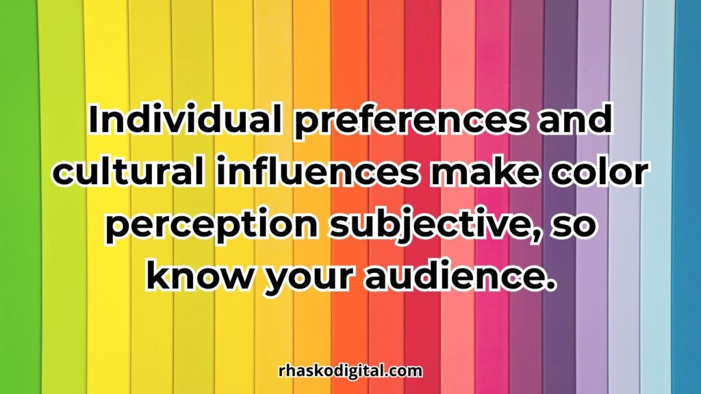
- Individual preferences and cultural influences make color perception subjective, so know your audience.
- The impact of color depends heavily on context; the same color can support or harm your brand based on how it’s used.
The Three Key Factors in Evaluating Color Choice
Emotion or symbolism? Yes. But it’s also about strategy, relevance, and context.
Choosing the right color for a brand or campaign goes beyond just evoking feelings, it requires aligning the color with the product’s purpose, the audience’s expectations, and the environment in which it will appear. Even the most powerful color emotionally can miss the mark if it doesn’t fit the bigger picture.
To avoid poor choices and ensure your color strategy works in real-world applications, consider these three essential factors:
1. Fit and Function
A color must match the context of what’s being sold. It should feel natural, relevant, and intuitive. This factor is all about appropriateness: Does the color make sense given the nature of the product or service?
✅ Example:
- Black for formal leather shoes (e.g., pantofel) feels timeless and sophisticated.
- Bright yellow for legal services might feel unserious or untrustworthy.
❌ Mismatch:
- A meditation app with a red interface may unintentionally create tension rather than calmness.
- A baby product using black and gray might feel too cold or industrial.
Key question to ask: Does this color feel right for what we’re offering?
If the answer is no, even if the color is beautiful or trendy it may hurt your credibility or confuse your audience.
2. Aesthetics
Aesthetics refers to how pleasing and visually balanced a color or color palette feels. People are naturally drawn to things that are harmonious and well-designed.
If your brand colors clash or feel chaotic, people may associate that dissonance with poor quality or lack of professionalism.
Consider:
- Color combinations: Do your colors complement or compete with each other?
- Contrast: Is the text readable? Do elements stand out without straining the eye?
- Tone consistency: Are your colors all bright, muted, or mixed randomly?
Good color aesthetic isn’t about choosing only safe colors, it’s about intentionality. Even bold, high-contrast palettes can work beautifully if they are well-balanced and consistent.
✅ Example:
- A tennis ball is neon yellow-green for high visibility—not necessarily beautiful, but functionally aesthetic in its use.
- A minimalist website with soft beige, white, and olive green can feel calming and premium.
Key question to ask: Do these colors look good together, and do they feel deliberate?
3. Value and Meaning
Color also carries symbolic value, both culturally and emotionally. This factor focuses on what the color communicates beyond its appearance. Even if a color is functional and pretty, it may send the wrong message.
Colors signal status, values, and tone. You must evaluate whether the emotional and symbolic meaning aligns with your brand positioning.
✅ Example:
- Gold and silver suggest luxury, success, and prestige.
- Green suggests sustainability, growth, and eco-consciousness.
- Pink often communicates softness, femininity, or playfulness (depending on shade and context).
❌ Mismatch:
- A luxury skincare brand using neon orange might feel off-brand, even if vibrant and trendy.
- A financial advisory firm using baby blue and pink pastels may appear too casual or ungrounded.
Key question to ask: What subconscious message does this color send and is it what we want?
Remember: consumers often make brand judgments within 90 seconds, and up to 90% of that judgment is based on color alone.
Practical Summary
These three factors: fit, aesthetic, and value, should be evaluated together. A color that scores high in one area but fails in another may still be risky. The goal is to balance all three, like a well-mixed formula
Key Takeaways:
- A good marketing color must fit the product context, look visually appealing, and communicate the right emotional or symbolic message.
- Poor color choices can weaken trust, create confusion, or send mixed signals, even if the design looks attractive.
- Always evaluate color through the lens of function, form, and meaning—not just trend.
Color-by-Color Breakdown: Meaning, Emotion, and Marketing Use
You might think it’s just about aesthetics. But it’s actually about psychology and strategy.
In marketing, color influences how people feel, think, and act, shaping first impressions and driving decisions. Each color triggers specific emotions: red creates urgency, blue inspires trust, green signals health, and more.
These effects aren’t accidental; brands use color intentionally to reinforce their message and connect with the right audience. Whether in logos, websites, packaging, or ads, the right color choice can increase engagement, build loyalty, and boost conversions.
Below, we break down key colors in marketing for what they mean, how they impact emotion, and how they’re used effectively in branding.
🔴 Red – Energy, Urgency, and Passion
Red is one of the most powerful and emotionally charged colors in marketing. It grabs attention instantly, stimulates the senses, and encourages quick action making it ideal for creating urgency or excitement.
This color is often linked to passion, energy, and appetite, which is why it’s widely used in fast food chains, sales promotions, and entertainment brands. Companies like Coca-Cola, YouTube, and KFC use red to appear bold, energetic, and unforgettable.
Best for: food & beverage, entertainment, impulse-driven products.
Use with care in industries like wellness, finance, or luxury, where a calmer or more refined tone is preferred.
🔵 Blue – Trust, Calm, and Stability
Blue is a color strongly associated with trust, calm, and dependability. It creates a sense of peace and order, which helps lower tension and build credibility, making it a top choice for brands in finance, healthcare, and technology.
Blue also conveys intelligence and professionalism, which is why it’s commonly used by companies that want to appear stable and secure. Brands like PayPal, Facebook, LinkedIn, and IBM use blue to inspire confidence and authority.
Best for: finance, technology, healthcare.
Avoid overuse in industries that rely on excitement, emotion, or creativity, as blue can feel too reserved or conservative in those contexts.
🟡 Yellow – Optimism, Energy, and Attention
Yellow radiates positivity, warmth, and youthful energy. It’s a cheerful color that instantly grabs attention, making it effective for capturing interest in crowded visual spaces.
Often associated with sunlight and joy, yellow can uplift mood and create a sense of friendliness and speed. That’s why brands like McDonald’s, IKEA, and Snapchat use yellow to appear approachable, fun, and energetic.
Best for: food, retail, children’s products, or budget-friendly offerings.
Avoid heavy use in luxury, high-end, or professional settings where sophistication or calm is expected. Yellow can cause visual strain and anxiety if overused or used in the wrong context.
🟠 Orange – Confidence, Playfulness, and Affordability
Orange blends the excitement of red with the optimism of yellow, creating a vibrant and playful tone. It conveys enthusiasm, creativity, and a sense of approachability, making it a strong choice for brands that want to feel energetic yet friendly.
Orange also signals affordability and value, which is why it’s frequently used by budget-conscious or youth-oriented companies. Brands like Home Depot, Payless, and Blogger use orange to appear fun, approachable, and full of energy. It’s encouraging DIY creativity, affordable fashion, or personal expression.
Best for: entertainment, e-commerce, creative fields, and youth markets.
Less suitable for industries that require formality, luxury, or a serious, conservative tone.
🟢 Green – Growth, Health, and Nature
Green represents harmony, renewal, and balance. It’s deeply connected to nature, making it a go-to choice for eco-friendly, health-conscious, and wellness brands.
At the same time, green is linked to prosperity and financial growth, which is why it’s also common in finance and banking sectors. Brands like Whole Foods and Tropicana use green to suggest freshness, vitality, or sustainable values. Lighter shades feel lively and clean, while darker greens project stability and wealth.
Best for: health, wellness, organic products, sustainability, finance.
Use carefully in fast-paced or tech-heavy industries where it may feel too relaxed or earthy.
🟣 Purple – Luxury, Mystery, and Spirituality
Purple combines the calm of blue and the energy of red, resulting in a color often associated with royalty, elegance, and depth. It evokes imagination, creativity, and sometimes mysticism.
Lighter purples can feel romantic or whimsical, while darker tones convey sophistication and prestige. Brands like Cadbury and Hallmark use purple to appear distinctive, artistic, or premium.
Best for: beauty, luxury goods, education, spirituality, and creative fields.
Avoid overuse in minimalist or utilitarian industries where clarity, simplicity, or seriousness is key.
💗 Pink – Femininity, Playfulness, and Romance
Pink is often associated with softness, care, and emotional warmth. It evokes feelings of love, innocence, and nurturing, making it ideal for brands that want to appear gentle, empathetic, or youthful.
However, not all pinks are delicate, bolder shades like hot pink can convey confidence, energy, and modern femininity. Brands like T-Mobile and Baskin-Robbins use pink to stand out with bold personality and emotional warmth. Pink signals confidence and energy, also evokes playfulness and sweet nostalgia. In both cases, pink helps create a fun, memorable, and emotionally engaging brand identity.
Best for: beauty, fashion, parenting, wellness, and romantic or youth-centered products.
Use cautiously in masculine, industrial, or formal corporate sectors, unless intentionally subverted for contrast or paired with grounding colors.
🤎 Brown – Earthiness, Reliability, and Warmth
Brown evokes a sense of stability, ruggedness, and tradition. It’s often associated with nature, comfort, and authenticity, making it ideal for organic, handmade, or outdoor-related products.
Brown gives off a grounded, trustworthy feel but can appear dull or outdated if not paired with lighter tones or vibrant accents. Brands like Nespresso, UPS, and Timberland use brown to suggest durability, reliability, and craftsmanship.
Best for: organic goods, craft items, coffee, outdoor gear, logistics.
Use cautiously in luxury or high-tech contexts, where it may lack the sleekness or innovation typically expected.
⚫ Black – Sophistication, Power, and Luxury
Black is bold, sleek, and timeless. It conveys authority, control, and high-end quality, making it a favorite in luxury fashion, tech, and automotive branding. Whether used as a primary or accent color, black enhances perceived value and elegance.
Brands like Chanel, Nike, and Apple utilize black to project power, simplicity, and exclusivity.
Best for: luxury fashion, premium tech, editorial, and upscale branding.
Avoid overuse in wellness, childcare, or casual products without softening elements to maintain approachability.
⚪ White – Simplicity, Clarity, and Purity
White represents cleanliness, freshness, and minimalism. It offers a sense of openness and calm while supporting other colors through contrast and negative space. In design, white helps create clarity and focus, often associated with modernity and efficiency.
Brands like Apple, Airbnb, and many medical institutions rely on white to communicate ease, hygiene, and trust.
Best for: healthcare, tech, wellness, lifestyle brands.
Use carefully in contexts requiring strong emotion or visual energy, as it can feel too sterile or cold when overused.
🩶 Gray – Neutrality, Maturity, and Balance
Gray symbolizes neutrality, professionalism, and quiet strength. It doesn’t evoke strong emotion, making it an ideal background or supporting color that adds seriousness without distraction.
Gray works well in corporate environments, giving off a sense of control, logic, and refinement. It’s commonly used in B2B marketing, finance, and automotive branding, seen in companies like Mercedes-Benz and LinkedIn where a mature and stable image is key.
Best for: B2B services, finance, automotive, corporate branding.
Avoid as a dominant color when appealing to younger or energetic audiences, as it may come across as dull, cold, or uninspiring.
🟨 Gold – Prestige, Wealth, and Tradition
Gold conveys opulence, excellence, and timeless value. It’s closely tied to wealth, celebration, and high achievement, making it perfect for brands that want to appear exclusive or prestigious.
Gold works especially well when paired with deep tones like black, navy, or burgundy to amplify its luxurious feel. Brands like Rolex, L’Oréal, and Versace use gold to elevate perception and signal premium quality.
Best for: luxury goods, high-end fashion, awards, elite services.
Avoid in casual, fast-moving consumer markets, where it may feel out of place or overly formal.
🪙 Silver – Innovation, Modernity, and High-Tech
Silver represents sleekness, precision, and future-focused design. It carries a sense of innovation and technological advancement, often used to signal sophistication without the warmth or extravagance of gold. Silver feels clean, cool, and modern, making it ideal for electronics, automotive, and high-performance products.
Brands like Apple, Lexus, and Sony use silver to convey quality, efficiency, and cutting-edge appeal.
Best for: tech products, innovation-driven brands, premium appliances.
Avoid overuse in organic, earthy, or human-centered industries where warmth, emotion, or authenticity are key values.
🟦 Turquoise/Teal – Clarity, Calm, and Refreshment
Turquoise or teal (often referred to as Tosca in some regions) blends the tranquility of blue with the balance of green, creating a tone that feels both refreshing and emotionally stable. It suggests clarity, creativity, and care, frequently used in wellness, personal care, modern SaaS, and eco-conscious branding.
Brands like Tiffany & Co. and various startups use teal to feel intelligent, clean, and emotionally accessible.
Best for: wellness, education, tech startups, and modern service brands.
Use sparingly in traditional or highly conservative sectors unless part of a rebranding strategy aiming for freshness and relevance.
Takeaways on Color-by-Color Use:
- Every color triggers specific emotions and associations, understanding these is key to brand clarity.
- Industry norms matter, some colors dominate in certain niches for good reason (e.g., blue in tech, green in wellness).
- The same color can signal different things depending on its tone, bold red feels urgent, while burgundy feels rich.
- Consistency is crucial. Colors must align across logo, website, packaging, and ads for effective branding.
How to Choose the Right Color for Your Brand
Now that you understand how colors can affect perception, emotions, and behavior, the next step is applying color psychology knowledge strategically to your own brand. Choosing the right brand color isn’t about picking your favorite hue, it’s about selecting a color (or palette) that aligns with your brand personality, target audience, and industry context.
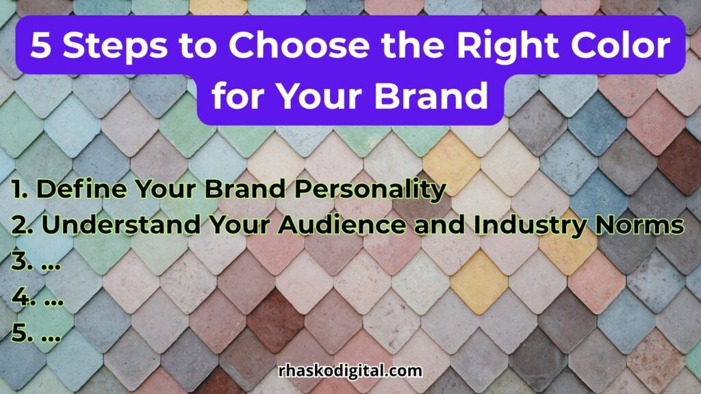
Here’s a simple framework to help guide your decision:
1. Define Your Brand Personality
Before you even think about color, you need to understand how you want your brand to be perceived. Ask yourself:
- Is your brand bold or minimal?
- More playful or serious?
- Do you want to feel premium, affordable, or approachable?
Once you’ve defined your brand’s personality traits, match them with colors that evoke similar emotional tones. For example:
- A fun and creative brand might lean toward orange or turquoise.
- A professional and reliable brand might stick with blue or gray.
- A luxurious brand might use black, gold, or deep purple.
2. Understand Your Audience and Industry Norms
Your audience’s demographics and expectations matter. A color that works well for Gen Z consumers may not land the same way with older, more conservative buyers. Similarly, each industry has unspoken color standards.
Examples:
- Blue dominates in tech and finance because it conveys trust and security.
- Green is popular in health, sustainability, and organic products.
- Black and gold are strong in high-end fashion and luxury.
Following the norm can build immediate trust but breaking it (intentionally) can make you stand out. Just make sure your divergence is strategic, not random.
3. Choose a Primary Color and Build Around It
Select one core color that will define most of your brand visuals like logo, website, packaging, etc. Then, build a palette with:
- Accent color(s) – to highlight buttons, CTAs, or supporting elements.
- Neutral base color – like white, gray, or beige, for background balance.
- Contrast consideration – make sure text is readable and visuals are accessible.
Tools like Coolors.co can help you explore complementary combinations quickly.
4. Test Before You Commit
Always test your color choices across formats:
- Does the color look good on screen and in print?
- Is it accessible for people with visual impairments (e.g., color blindness)?
- How does the palette feel across landing pages, product photos, and ads?
You can also A/B test landing pages or social media posts to see which palette performs better with your target audience.
5. Be Consistent
Once you’ve chosen a palette, stick to it. Consistency across your brand visuals builds recognition and trust. Include your color guidelines in your brand style guide, and ensure everyone, designers, marketers, developers, all follows it.
Key Takeaways:
- Choose colors based on brand personality, not personal taste.
- Know what your audience expects and whether you want to meet or challenge those expectations.
- Build a full palette, test for readability and emotion, and stay consistent across platforms.
Visual Marketing Techniques Using Color
Understanding color psychology is only useful if you apply it correctly in visual marketing. Every image, button, banner, and layout you create is a visual message and color is often the first thing your audience notices.
In this section, we’ll explore tactical ways to use color for attention, emotion, navigation, and conversion.
1. Use Color to Guide the Eye (Visual Hierarchy)
Color can be used to direct attention. By applying contrasting or bold colors to specific elements, you help the viewer know where to look first and what action to take next.
- Call-to-action (CTA) buttons should stand out from the background (e.g., red or orange on a white site).
- Headlines can use brand colors, while body text stays neutral for easy readability.
- Avoid using too many competing colors, which can confuse the viewer.
Tip: One bold color + one neutral + one accent = clean, effective structure.
2. Emotional Framing Through Color Backgrounds
The background color of an image, landing page, or ad sets the emotional tone.
- Blue or soft green backgrounds create calm and trust (ideal for finance, education, health).
- Warm backgrounds (like yellow, coral, or orange) evoke energy and positivity (great for product launches or youth brands).
- Black or dark backgrounds add drama, luxury, or seriousness, often used in high-end fashion or tech.
Match the emotion of the background with the intent of the message to avoid sending mixed signals.
3. Seasonal and Trend-Based Color Usage
Colors have seasonal associations, which marketers can use to feel timely and relevant.
Different seasons often evoke distinct color palettes that align with the mood and atmosphere of each time of year:
- Spring is associated with soft pastels, fresh greens, and bright blues. Colors that reflect renewal, growth, and new beginnings.
- Summer brings vibrant hues like sunny yellow, bright orange, and refreshing turquoise, capturing the energy and warmth of the season.
- Autumn leans into earthy tones such as brick red, warm orange, and rich browns, evoking a sense of coziness and change.
- Winter is characterized by deep blues, shimmering silver, crisp white, and touches of gold, representing calm, elegance, and festivity.
Each seasonal palette offers unique emotional cues that can be leveraged in design, fashion, or branding.
Using seasonal palettes in social media or campaign visuals can subtly connect your brand with time-based relevance.
Additionally, keep an eye on color trends (e.g., Pantone Color of the Year) to ride cultural momentum when appropriate.
4. Color Consistency Across Platforms
Brand recognition improves when your color usage is consistent across:
- Website
- Social media
- Packaging
- Ads
- Print materials
Ensure hex codes or CMYK values remain the same everywhere. A different shade of “blue” on each platform can dilute brand impact. Use a brand style guide to keep everyone aligned.
5. Contrast and Accessibility Matter
Good design is very usable. Make sure your color combinations are readable and accessible for all users.
- Use high contrast between background and text.
- Avoid red-green combinations without alternatives (color blindness issue).
- Test with tools like WebAIM Contrast Checker.
Brands that ignore accessibility risk not only bad UX but also losing audience trust and legal compliance.
Key Takeaways:
- Color can guide attention, trigger emotion, and enhance usability in your marketing visuals.
- Use bold, intentional colors for CTAs and emotional framing, but avoid overwhelming the viewer.
- Maintain consistency across channels and ensure your visuals are readable and accessible to all users.
Conclusion & Action Steps in Color Psychology for Your Business
Color is more than decoration. It’s a silent language that shapes how people feel, decide, and remember. Throughout this guide, we’ve explored how different colors influence buyer behavior, how psychological and cultural factors affect perception, and how to choose and apply color strategically in your brand and marketing efforts using color psychology.
In today’s attention-driven economy, where every second counts. A well-chosen color can help your message stand out, your brand be remembered, and your product trusted without saying a single word.
If you want your marketing to connect, convert, and leave a lasting impression, don’t leave color to chance. Treat it as the strategic asset it is.
Action Steps to Apply This Knowledge
Here’s how to move from theory to action:
1. Revisit Your Brand Color Palette
Ask: Does your current palette reflect the values, tone, and audience of your brand? If not, consider adjusting or refining it.
2. Map Out the Emotional Goals of Each Campaign
Before designing a landing page, ad, or packaging. Define what feeling you want to evoke. Choose color accordingly.
3. Create a Visual Hierarchy Using Color
Use bold or contrasting colors to highlight buttons, key messages, and navigation. Let color guide the user’s eye.
4. Run A/B Tests on Color Variants
Try testing different button or banner colors to see what converts better. Let data validate your color choices.
5. Document Your Colors in a Brand Guide
Record your primary, secondary, and accent color codes (HEX, RGB, CMYK) in a brand manual for team-wide consistency.
6. Check for Accessibility and Readability
Ensure your color combinations meet contrast and accessibility standards. Don’t sacrifice clarity for aesthetics.
Final Thought
Color is fast, emotional, and universal but it’s also nuanced and strategic. When used with intention, it doesn’t just make things “look nice”, it helps your message land, your product sell, and your brand endure.
The most successful marketers and designers aren’t just artists. They’re color psychologists whether they realize it or not.
Colors play a big role in first impressions. Not sure which one fits your brand best? Just send an email at info@rhaskodigital.com. We will work together to achieve your goals.